←
Product Design
Full Case Study
hello82 wherever you are!
hello82 wherever you are!
Complete redesign of mobile app to improve customer engagement.
Complete redesign of mobile app to improve customer engagement.
Role
Product Designer
Role
Product Designer
Team
1 Product Designer
1 PM
Team
1 Product Designer
1 PM
Timeline
July - September 2025
Timeline
July - September 2025
Tools
Figma
Tools
Figma
The Background
Connecting K-Pop Fans Through Commerce and Community
Connecting K-Pop Fans Through Commerce and Community
hello82 is a global K-pop platform that connects fans with their favorite artists through exclusive merchandise and in person POP-UP events. As a product design intern, I led user research and designed a loyalty program that increased engagement, streamlined shopping, and improved event discovery. This work reduced navigation errors by 40% and increased user engagement by 10%.
hello82 is a global K-pop platform that connects fans with their favorite artists through exclusive merchandise and in person POP-UP events. As a product design intern, I led user research and designed a loyalty program that increased engagement, streamlined shopping, and improved event discovery. This work reduced navigation errors by 40% and increased user engagement by 10%.

The Problem
85.7% of fans disappeared before checkout
85.7% of fans disappeared before checkout
K-pop fans are highly passionate, but that excitement does not always translate into completed purchases or continued engagement. When I spoke with customers at hello82 POP-UP events, many described getting lost in the app, repeatedly backtracking, and struggling to find merchandise or upcoming events. Instead of making fandom feel exciting and rewarding, the experience created friction and gave fans little reason to return.
K-pop fans are highly passionate, but that excitement does not always translate into completed purchases or continued engagement. When I spoke with customers at hello82 POP-UP events, many described getting lost in the app, repeatedly backtracking, and struggling to find merchandise or upcoming events. Instead of making fandom feel exciting and rewarding, the experience created friction and gave fans little reason to return.

that's me!
Before
When discovery breaks down, loyalty disappears
When discovery breaks down, loyalty disappears
Fans struggled to find what they wanted due to the lack of search, filter, and progress-tracking features, causing many to drop off before completing a purchase and reducing overall engagement.
Fans struggled to find what they wanted due to the lack of search, filter, and progress-tracking features, causing many to drop off before completing a purchase and reducing overall engagement.


After
These insights led us to improve navigation and introduce a loyalty program.
These insights led us to improve navigation and introduce a loyalty program.
A new merch experience allows fans to easily search and filter by artist, album, or category
A new merch experience allows fans to easily search and filter by artist, album, or category


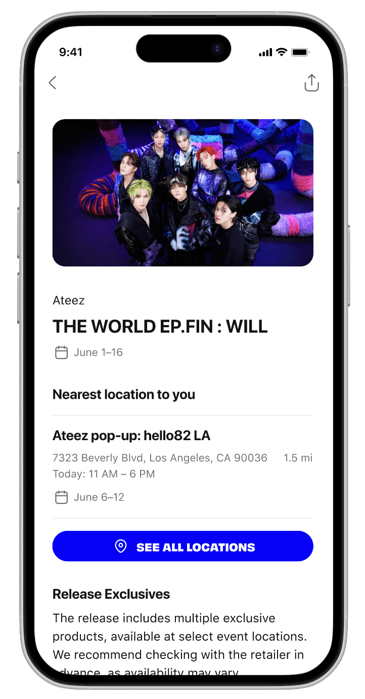
A redesigned event flow lets fans easily find nearby experiences with filters
A redesigned event flow lets fans easily find nearby experiences with filters


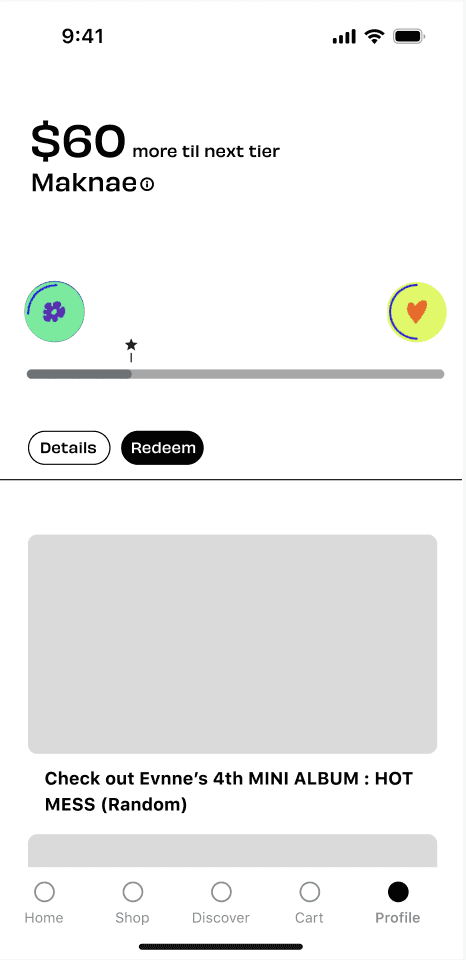
A rewards system that highlights points, redemption options, and tier progression to keep fans engaged.
A rewards system that highlights points, redemption options, and tier progression to keep fans engaged.


Iterations
Validation and iteration came from multiple rounds of user feedback
Validation and iteration came from multiple rounds of user feedback
Event Discovery 🗓️
The visually engaging map view soon proved cluttered and unscalable, while the list view offered a more practical, efficient, and easily navigable solution for sorting, filtering, and comparing events.
The visually engaging map view soon proved cluttered and unscalable, while the list view offered a more practical, efficient, and easily navigable solution for sorting, filtering, and comparing events.

Map View
Visually pleasing, but not scalable and will eventually be more cluttered when more stores open/venues.

List View
Scalable and efficient, enabling quick sorting, filtering, and comparison of events without visual clutter.

Map and List View
Combining the map and list added visual weight and redundancy, making the interface feel busy.
Loyalty Program 🎁
User testing revealed that fans cared more about seeing how many points they needed to redeem rewards than how close they were to the next tier, leading me to shift the focus from tier progression to reward accessibility.


click through to see iterations
Merch Experience 🛍️
Early tests showed that fans struggled to find products they wanted due to long scrolling, leading us to simplify search and browsing.
Early tests showed that fans struggled to find products they wanted due to long scrolling, leading us to simplify search and browsing.


click through to see iterations
Learnings
Key Takeaways
Key Takeaways
Building out a design system — It’s so important to create reusable components so our designs remain consistent and scalable.
Good design starts with good research — Since I was redesigning the mobile app from the ground up, I spoke with users to understand their specific pain points and prioritize the most important design opportunities.
Building out a design system — It’s so important to create reusable components so our designs remain consistent and scalable.
Good design starts with good research — Since I was redesigning the mobile app from the ground up, I spoke with users to understand their specific pain points and prioritize the most important design opportunities.